Logos
![]()
![]()
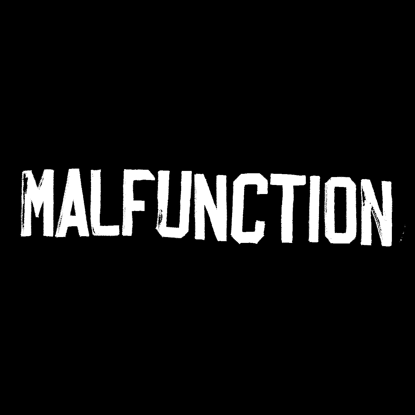
Malfunction
After drafting for a while and not finding the right aesthetic we shifted focus and went the opposite direction. A metal/rock club logo doesn’t necessarily need to have dragons, swords, crucifixes, etc. These letters come from a varsity jacket of mine. They express a rough, on-the-move vibe with the sloping baseline, and most important: not square, not linear, not conventional.


